Congratulations, somebody just shopped in your store. That’s fantastic! But what about the next shopper? Will they choose you again, opt for a competitor, or simply decide a movie sounds better?
For researchers like us, retailers are constantly asking one fundamental question: “Why?” Why our store? Why the other guy’s? (And yes, sometimes, how was the movie?). A significant amount of resources are invested in understanding and quantifying the reasons consumers make the choices they do, especially when it comes to shopping. We want to understand not only why a consumer chooses one retailer over another, but also the relative importance of each of those reasons in their decision-making process.
Traditionally, studies often attempt to measure the importance of product features or retail experiences explicitly and in isolation. This often involves asking consumers directly how important various attributes are, often using Likert scales. For example, a common approach might be to look at “top-2 box” scores, where attributes rated as a “9” or “10” (on a 10-point Likert scale) are deemed highly important.
While seemingly straightforward, relying solely on explicit importance ratings through traditional Likert scales presents several challenges, which is why I generally don’t recommend it as the primary method for measuring importance.
The Pitfalls of Stated Importance
1. Lack of Discrimination: Imagine an interview where a customer is asked about their last visit to “Dino’s House of Statistics”:
Q: “How important were prices?”
A: “Oh, prices are very important.”
Q: “How important was the convenience?”
A: “Oh, convenience was very important.”
Q: “How important were helpful store employees?”
A: “Oh, that was very important too.”
As you can see, everything can appear “very important.” This phenomenon, known as response bias or ceiling effect, makes it difficult to differentiate between truly critical factors and those that are simply desirable. When every attribute is rated highly, it offers little actionable insight for prioritization.
2. Idiosyncratic Scale Usage: People interpret and use rating scales differently. Consider Bob and Mary rating the same three attributes:
- Bob:
- Price: 9
- Convenience: 7 (not as important as price)
- Helpful Employees: 8 (less important than price, more than convenience)
- Mary:
- Price: 6
- Convenience: 4 (not as important as price)
- Helpful Employees: 5 (less important than price, more than convenience)
Bob and Mary exhibit the same relative pattern (Price > Employees > Convenience), yet their absolute scores differ significantly. Bob’s “9” might be Mary’s “6.” The relative nature of scales means that comparing absolute scores across individuals can lead to misinterpretations. This can be particularly problematic for “top-box” analysis, as Mary’s answers wouldn’t qualify, despite her having the same internal prioritization as Bob.
While there are specific situations where stated importance is appropriate and useful, and more sophisticated methods exist for measuring it (a good starting point for further exploration would be Maximum Differential Scaling, aka MaxDiff), for a robust understanding of what truly drives customer behavior, we turn to Derived Importance.
Measuring Derived Importance: The Power of Key Drivers Analysis
Key drivers analysis offers a more insightful approach by deriving importance from the observed impact of various attributes on critical outcome metrics. These outcome metrics, often referred to as Key Performance Indicators (KPIs), can include overall customer satisfaction, likelihood to return, likelihood to recommend (Net Promoter Score, or NPS), or a composite index of these.
A typical key drivers analysis survey structure looks like this:
Overall Outcome Metric (Dependent Variable):
Q: “Thinking about your experience at Dino’s House of Statistics, please rate your overall satisfaction on a scale of 1 (‘not at all satisfied’) to 10 (‘completely satisfied’).”
Specific Attribute Performance (Independent Variables):
Q: “Now, using the same scale, please rate your satisfaction with Dino’s on each of the following:”
- Variety of products and services
- Professional appearance of staff
- Length of wait time
- Ease of finding things in store (wayfinding)
- Efficiency of transaction process (checkout speed)
- Convenient parking
- Convenient store location
The Analytics Behind Derived Importance
The science happens in the analytical phase. The output of this analysis provides us with coefficients (or correlation coefficients, in simpler models like Pearson r²), which quantify the strength and direction of the relationship. A higher coefficient indicates a stronger influence, meaning that improvements in that attribute will have a greater impact on the overall outcome. For example, in a simple correlation, a coefficient closer to 1.0 (or -1.0 for a negative correlation) signifies a strong relationship, while 0.0 indicates no relationship.
Tangential note: Yes, statisticians (like Karl Pearson) do seem to like naming methods after themselves, though modern statistical software makes these analyses more accessible than ever.
In a key drivers analysis, the higher the correlation or regression coefficient between a specific attribute and overall satisfaction, the more influence that attribute has on satisfaction, and therefore, the more important it is. Crucially, we never have to explicitly ask “how important is…” as the data inherently reveals the importance.
Visualizing Insights: The Importance-Performance Matrix
But importance is only half the equation. We also need to understand how well we’re performing on each of these attributes. By combining derived importance with explicit performance ratings on each attribute, we can create a powerful Importance-Performance Matrix (or Quadrant Analysis). This visual tool helps prioritize areas for improvement.
The resulting output often looks something like this (imagine a scatter plot where the X-axis is Derived Importance and the Y-axis is Performance Rating):
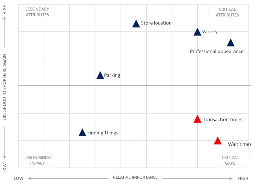
Example Output Interpretation:
- In our example, “Professional Appearance of Staff” and “Length of Wait Time” emerge as the most important attributes, exhibiting high correlations to overall satisfaction (e.g., above 0.750). This indicates they are significant drivers of customer satisfaction.
- “Store Location,” while still positively correlated, shows a lower correlation (e.g., just over 0.520), suggesting it has less direct impact on overall satisfaction in this specific context.
Now, let’s consider performance:
- Our store’s employees rate highly on “Professional Appearance,” making it a core strength. We’re performing well on a highly important attribute.
- However, “Length of Wait Time” receives the lowest performance rating, despite being a critically important attribute. This identifies a major area for improvement.
Actionable Insights for Retailers
Armed with this information, management can make data-driven decisions:
- Prioritize Improvements: Resources should be strategically directed towards reducing wait times (e.g., more modern POS systems, increased staffing during peak hours, self-checkout options) and improving transaction efficiency.
- Enhance Wayfinding: Better in-store signage, digital store maps via apps, or clear merchandising strategies can help customers find items more easily.
- Maintain Strengths: Continue to invest in staff training and professional development to ensure high standards of professionalism are maintained.
The Bottom Line
Key drivers analysis precisely and reliably identifies the few, specific attributes that, when improved, will have the most significant and measurable impact on overall customer satisfaction and, consequently, on repeat business and customer loyalty. In today’s competitive retail landscape, understanding these drivers is no longer a luxury but a necessity for sustainable growth. By focusing on what truly matters to your customers, you can transform a single sale into a lasting relationship, keeping them coming back to your store, not someone else’s, and certainly not just heading to the movies.